La Marzocco Redesign
Bring La Marzocco quality into the app
Espresso Machine Companion
Service
App Redesign
Design type
Mobile App
Platform
B2C
Audience
Overview
Redesigned the La Marzocco app UI to simplify core interactions and create a clearer, more effortless user experience.
As a coffee lover and daily user of the La Marzocco app, I decided to redesign this app because every time I opened the app it didn’t feel handy.
It takes too many taps to reach my device, and even more to turn it on. The app feels flat and lacks hierarchy. And several details don’t match La Marzocco’s premium standards.
I wanted to make it clearer, add more fun and colors, and most importantly, improve the usability.
Problem
The La Marzocco app needed a redesign to reflect the premium brand quality of its espresso machines. It was missing the brand personality, made main controls harder to reach than they should be, and looked mediocre like many other control apps.
It needed a redesign to add more character and make daily use feel simpler and more enjoyable.
Redesign vs Original
Highlights
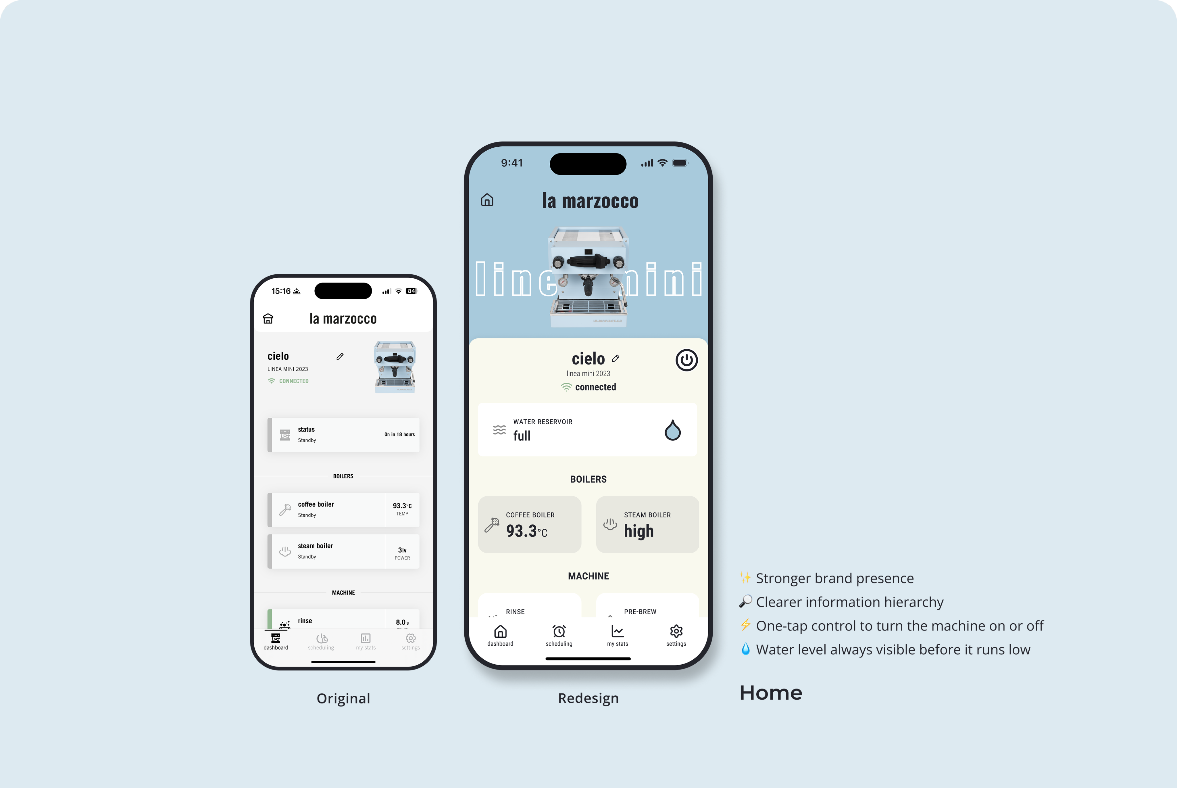
More compact home screen
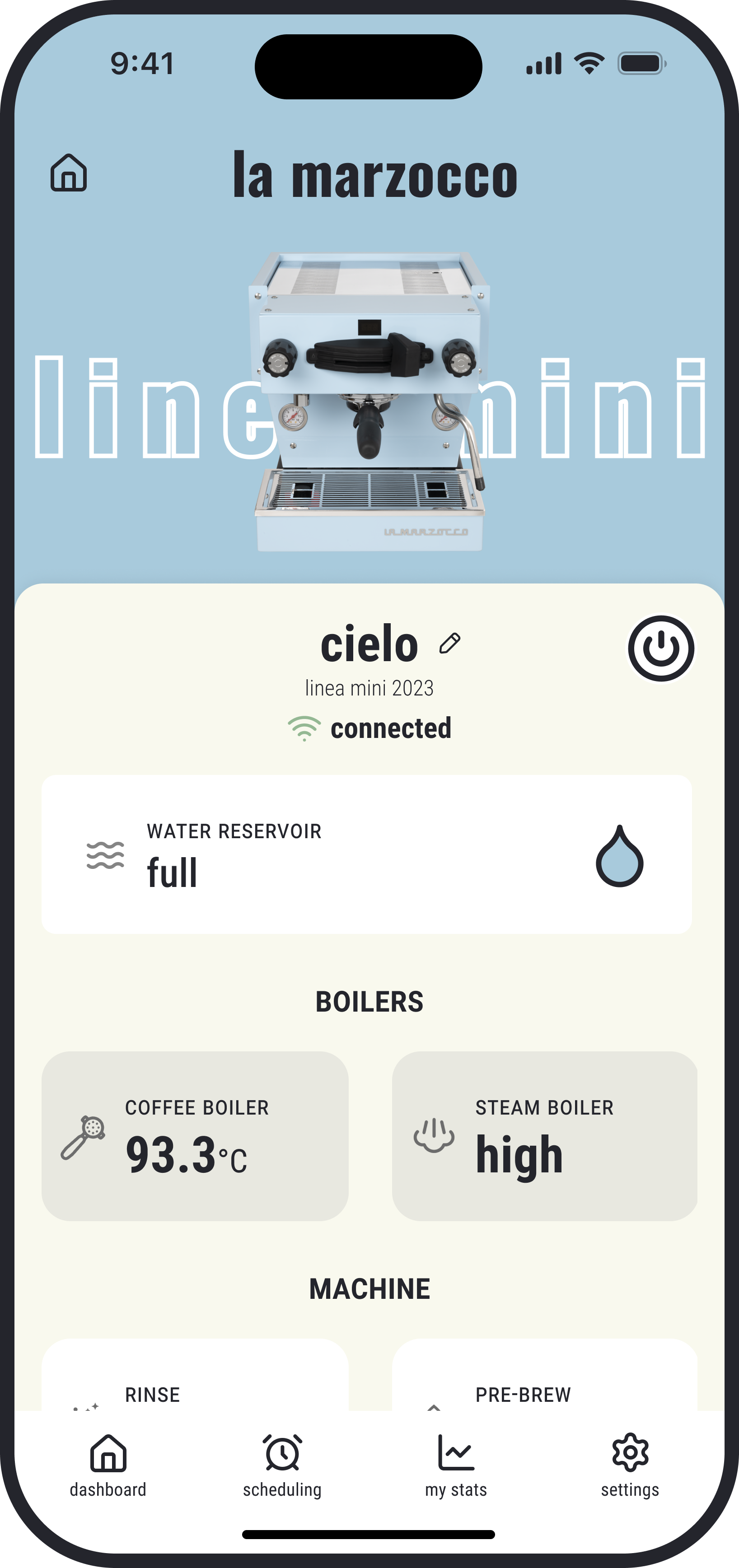
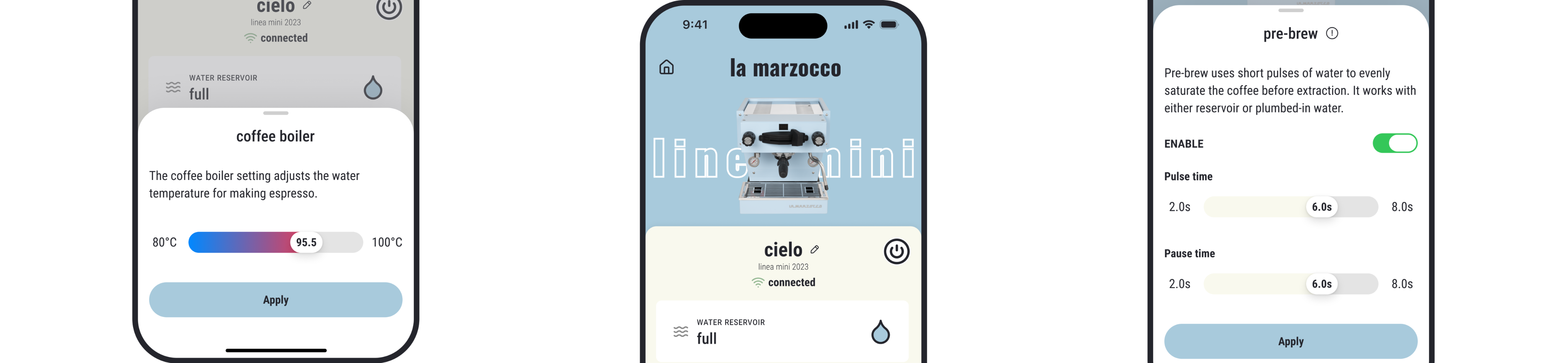
The redesigned home screen improves visual hierarchy by highlighting key machine status and minimizing secondary details. Primary controls are now easier to reach with fewer taps, including a surface-level power control for quick on/off.
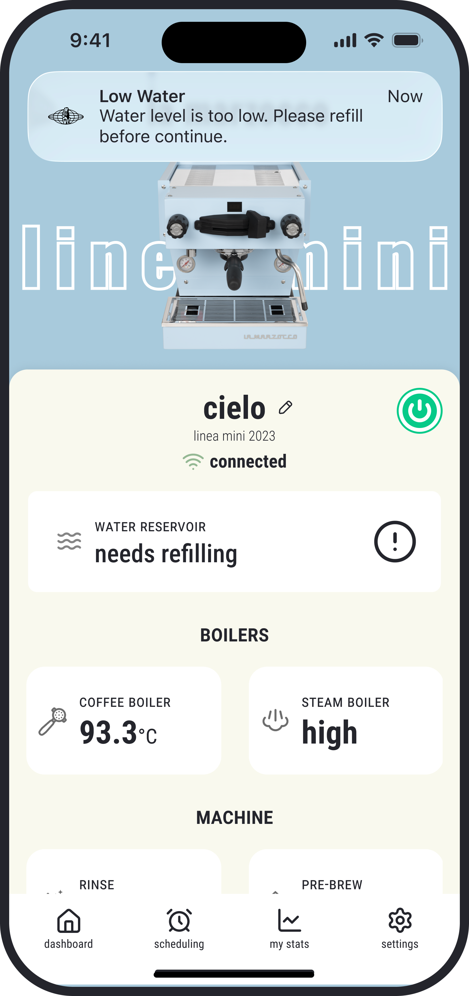
Alert for low water level
The new low-water status lets users know when a refill is needed and helps avoid unexpected heating interruptions. Even when they’re not on the screen, a popup alert will still notify them.
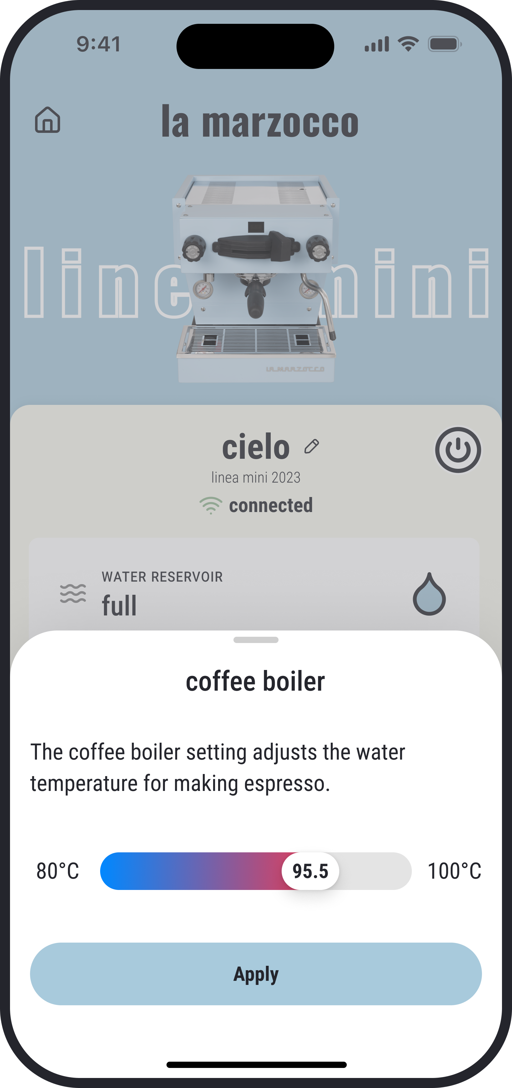
More intuitive coffee-boiler control
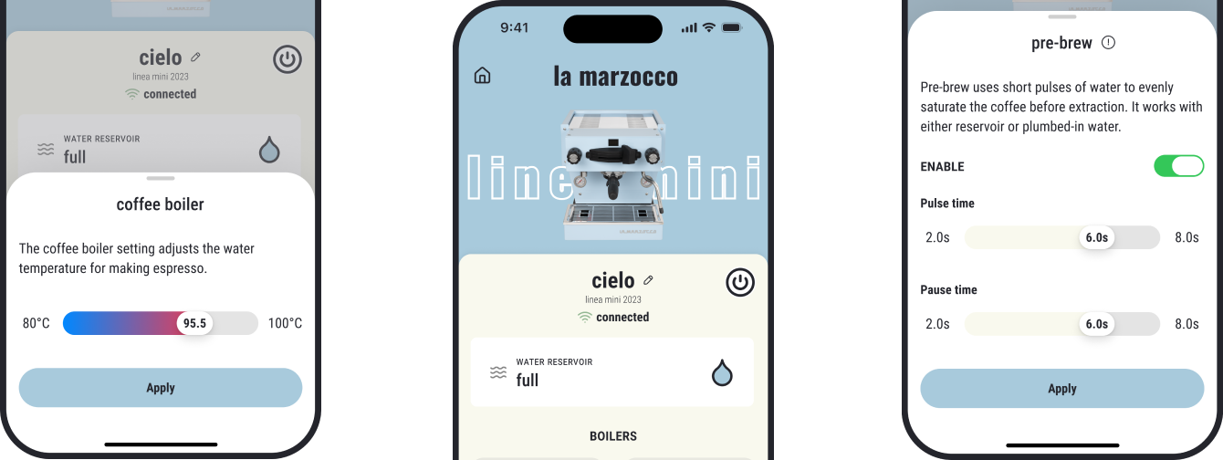
Temperature adjustment is now smoother with a direct slider and a colored scale that makes the full range easy to read. The interface stays cleaner without extra units, and changes only apply when the user presses Apply, preventing unnecessary energy use during adjustments.
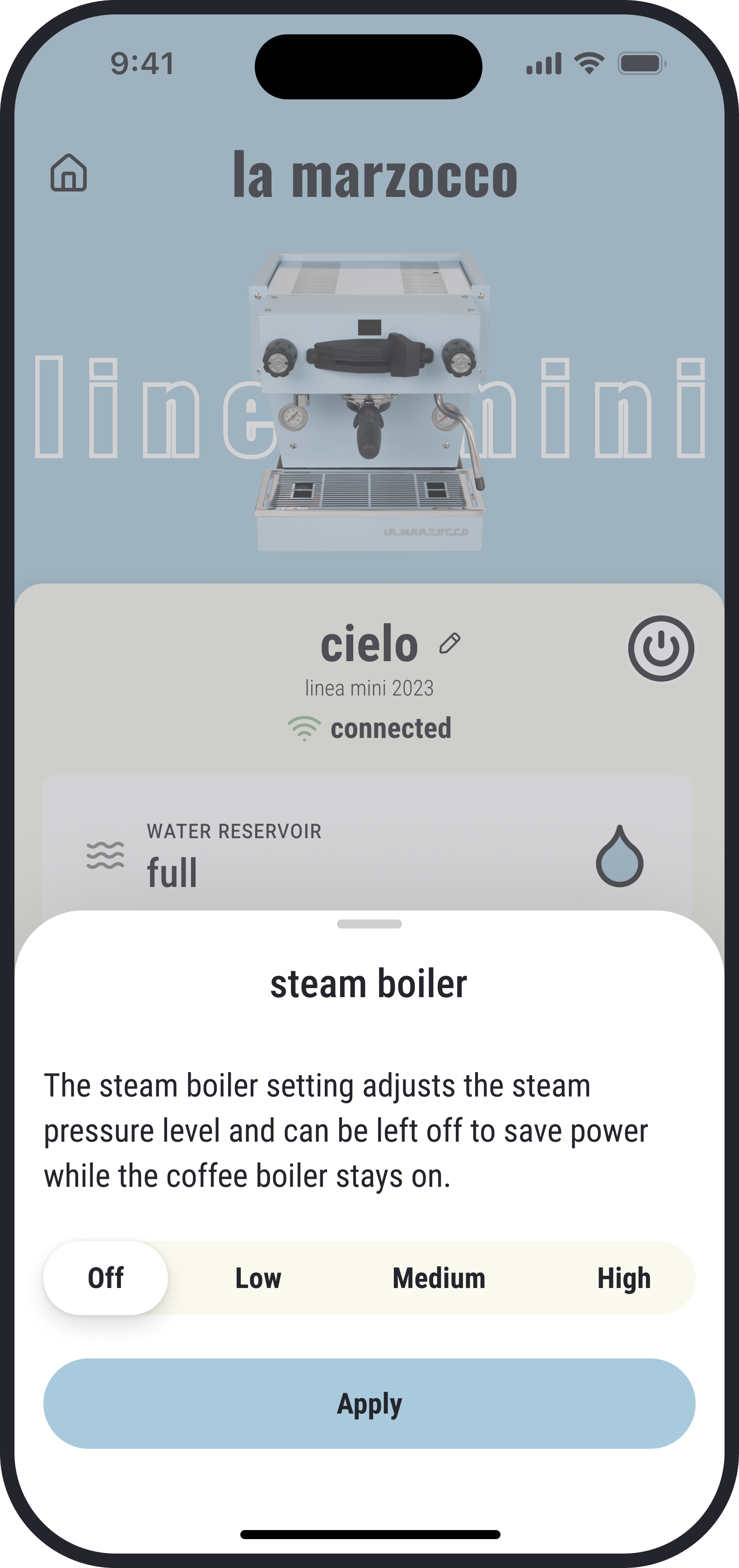
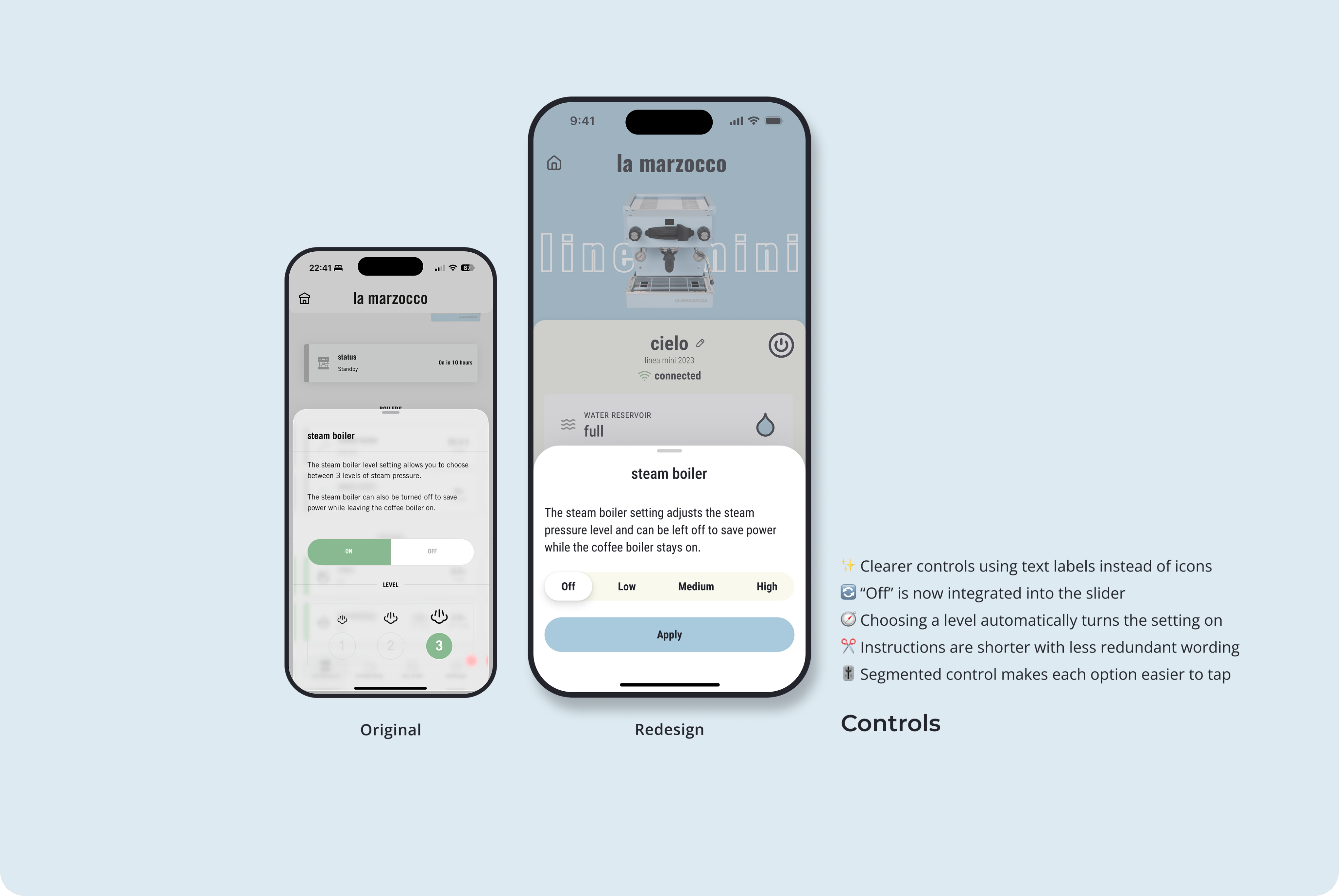
More intuitive steam-boiler control
Steam-boiler settings are clearer with text labels replacing icons and Off integrated directly into the segmented control. The layout removes redundant elements and shortens instructions, making each level feel more direct and easier to understand.
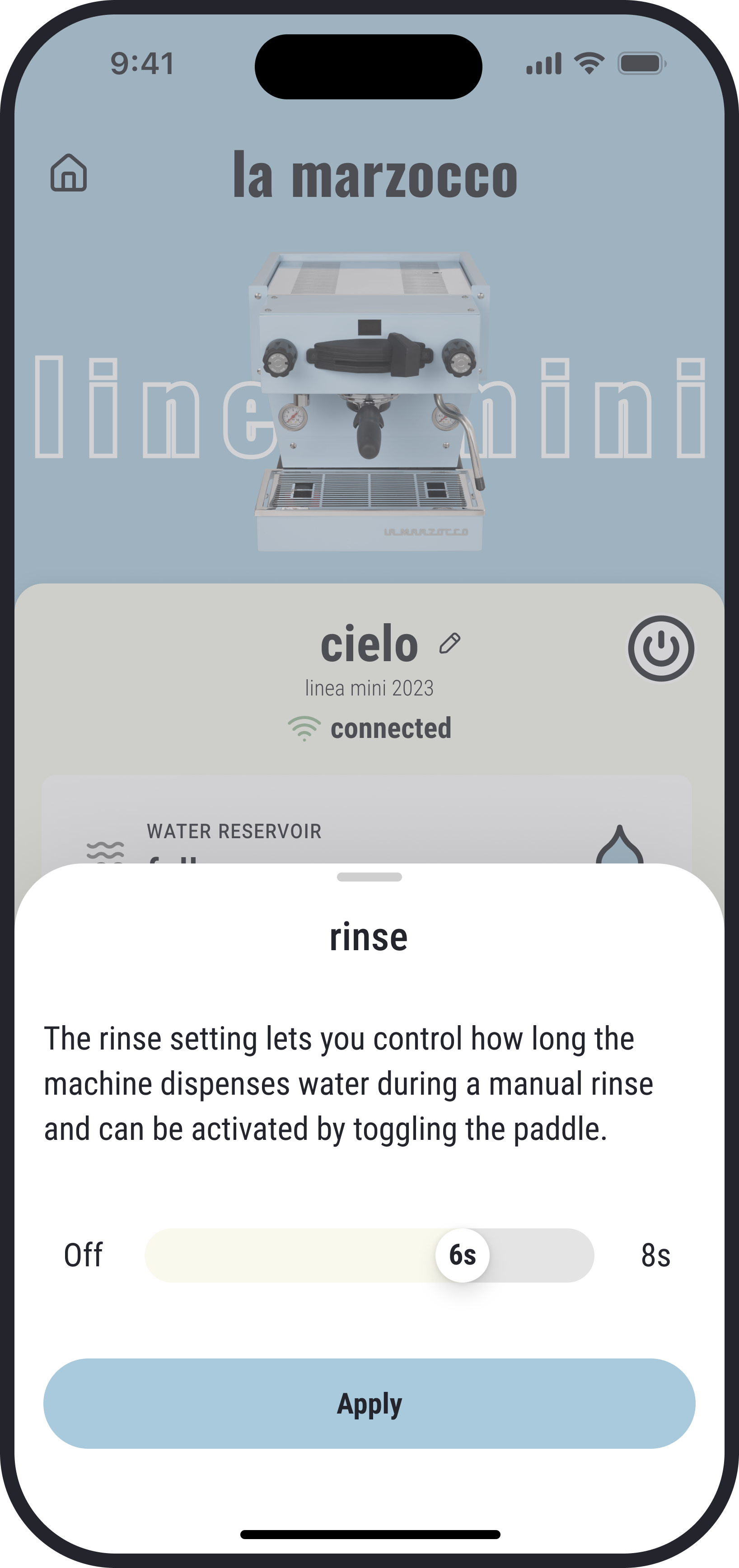
A simpler rinse control
Steam-boiler settings are clearer with text labels replacing icons and Off integrated directly into the segmented control. The layout removes redundant elements and shortens instructions, making each level feel more direct and easier to understand.
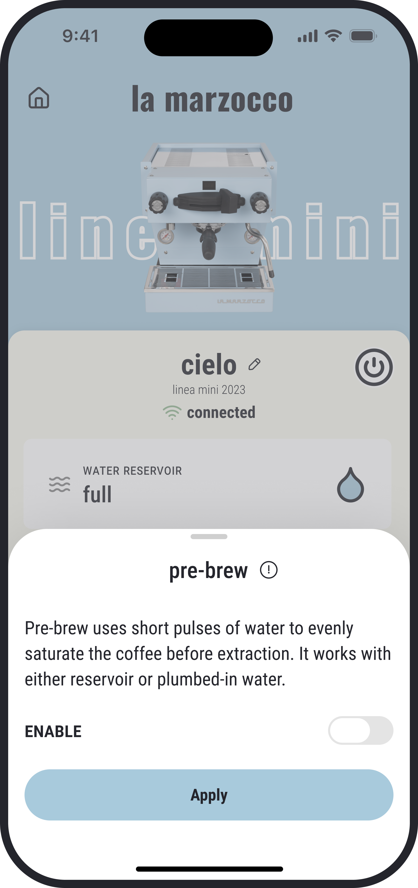
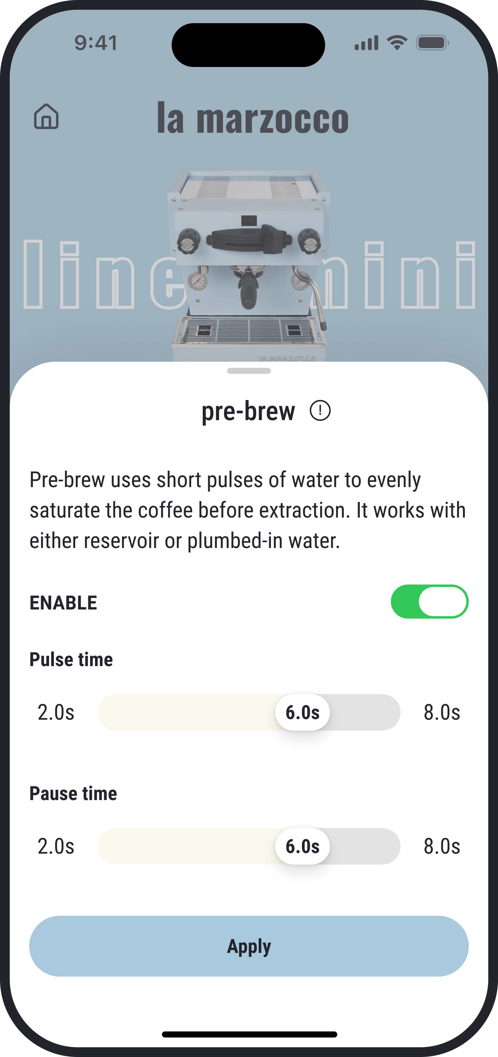
Clearer pre-brew settings
Pre-brew is now clearer with unrelated text moved under an Info icon and settings that only appear when the toggle is on. Each control is renamed for greater transparency, and the feature name is updated to “pre-brew” to keep terminology consistent across the app.
Ending
As a daily user of the La Marzocco app, I pulled a lot of ideas directly from my own pain points and the little frictions I ran into while making coffee. This project gave me a chance to think about how the design can better support the brewing process and make controls easier for different types of users. Some highlights I really enjoyed shaping are the low-water status and reminder, using sliders instead of steppers to make settings adjustments easier, and having bigger and clearer status on the Home Screen.
I didn’t get the chance to redesign every screen in the app, but in the future I hope to explore more of them and make the overall experience feel more complete.

La Marzocco Redesign
Bring La Marzocco quality into the app
Espresso Machine Companion
Service
App Redesign
Design type
Mobile App
Platform
B2C
Audience
Overview
Redesigned the La Marzocco app UI to simplify core interactions and create a clearer, more effortless user experience.
As a coffee lover and daily user of the La Marzocco app, I started thinking about this redesign because every time I opened the app it didn’t feel handy.
It takes too many taps to reach my device, and even more to turn it on. The app feels flat and lacks hierarchy. And several details don’t match La Marzocco’s premium standards.
I wanted to make it clearer, add more fun and colors, and most importantly, improve the usability.
Problem
The La Marzocco app needed a redesign to reflect the premium brand quality of its espresso machines. It was missing the brand personality, made main controls harder to reach than they should be, and looked mediocre like many other control apps.
It needed a redesign to add more character and make daily use feel simpler and more enjoyable.
Redesign vs Original
Highlights
More compact home screen
The redesigned home screen improves visual hierarchy by highlighting key machine status and minimizing secondary details. Primary controls are now easier to reach with fewer taps, including a surface-level power control for quick on/off.
Alert for low water level
The new low-water status lets users know when a refill is needed and helps avoid unexpected heating interruptions. Even when they’re not on the screen, a popup alert will still notify them.
More intuitive coffee-boiler control
Temperature adjustment is now smoother with a direct slider and a colored scale that makes the full range easy to read. The interface stays cleaner without extra units, and changes only apply when the user presses Apply, preventing unnecessary energy use during adjustments.
More intuitive steam-boiler control
Steam-boiler settings are clearer with text labels replacing icons and Off integrated directly into the segmented control. The layout removes redundant elements and shortens instructions, making each level feel more direct and easier to understand.
A simpler rinse control
Steam-boiler settings are clearer with text labels replacing icons and Off integrated directly into the segmented control. The layout removes redundant elements and shortens instructions, making each level feel more direct and easier to understand.
Clearer pre-brew settings
Pre-brew is now clearer with unrelated text moved under an Info icon and settings that only appear when the toggle is on. Each control is renamed for greater transparency, and the feature name is updated to “pre-brew” to keep terminology consistent across the app.
Ending
As a daily user of the La Marzocco app, I pulled a lot of ideas directly from my own pain points and the little frictions I ran into while making coffee. This project gave me a chance to think about how the design can better support the brewing process and make controls easier for different types of users. Some highlights I really enjoyed shaping are the low-water status and reminder, using sliders instead of steppers to make settings adjustments easier, and having bigger and clearer status on the Home Screen. I didn’t get the chance to redesign every screen in the app, but in the future I hope to explore more of them and make the overall experience feel more complete.

La Marzocco Redesign
Bring La Marzocco quality into the app
Espresso Machine Companion
Service
App Redesign
Design type
Mobile App
Platform
B2C
Audience
Overview
Redesigned the La Marzocco app UI to simplify core interactions and create a clearer, more effortless user experience.
As a coffee lover and daily user of the La Marzocco app, I started thinking about this redesign because every time I opened the app it didn’t feel handy.
It takes too many taps to reach my device, and even more to turn it on. The app feels flat and lacks hierarchy. And several details don’t match La Marzocco’s premium standards.
I wanted to make it clearer, add more fun and colors, and most importantly, improve the usability.

Problem
The La Marzocco app needed a redesign to reflect the premium brand quality of its espresso machines. It was missing the brand personality, made main controls harder to reach than they should be, and looked mediocre like many other control apps.
It needed a redesign to add more character and make daily use feel simpler and more enjoyable.
Redesign vs Original
Highlights
More compact home screen
The redesigned home screen improves visual hierarchy by highlighting key machine status and minimizing secondary details. Primary controls are now easier to reach with fewer taps, including a surface-level power control for quick on/off.
Alert for low water level
The new low-water status lets users know when a refill is needed and helps avoid unexpected heating interruptions. Even when they’re not on the screen, a popup alert will still notify them.
More intuitive coffee-boiler control
Temperature adjustment is now smoother with a direct slider and a colored scale that makes the full range easy to read. The interface stays cleaner without extra units, and changes only apply when the user presses Apply, preventing unnecessary energy use during adjustments.
More intuitive steam-boiler control
Steam-boiler settings are clearer with text labels replacing icons and Off integrated directly into the segmented control. The layout removes redundant elements and shortens instructions, making each level feel more direct and easier to understand.
A simpler rinse control
Steam-boiler settings are clearer with text labels replacing icons and Off integrated directly into the segmented control. The layout removes redundant elements and shortens instructions, making each level feel more direct and easier to understand.
Clearer pre-brew settings
Pre-brew is now clearer with unrelated text moved under an Info icon and settings that only appear when the toggle is on. Each control is renamed for greater transparency, and the feature name is updated to “pre-brew” to keep terminology consistent across the app.
Ending
As a daily user of the La Marzocco app, I pulled a lot of ideas directly from my own pain points and the little frictions I ran into while making coffee. This project gave me a chance to think about how the design can better support the brewing process and make controls easier for different types of users. Some highlights I really enjoyed shaping are the low-water status and reminder, using sliders instead of steppers to make settings adjustments easier, and having bigger and clearer status on the Home Screen. I didn’t get the chance to redesign every screen in the app, but in the future I hope to explore more of them and make the overall experience feel more complete.