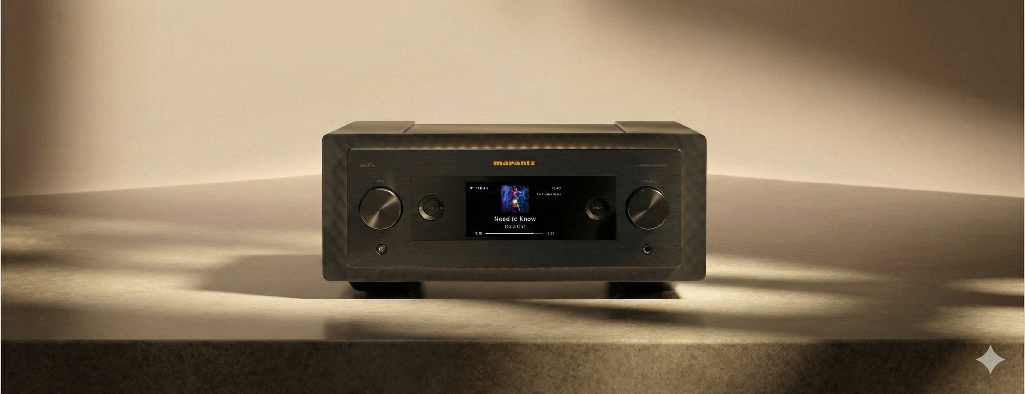
Hi-Fi Interface Redesign
More immersive Now Playing experience
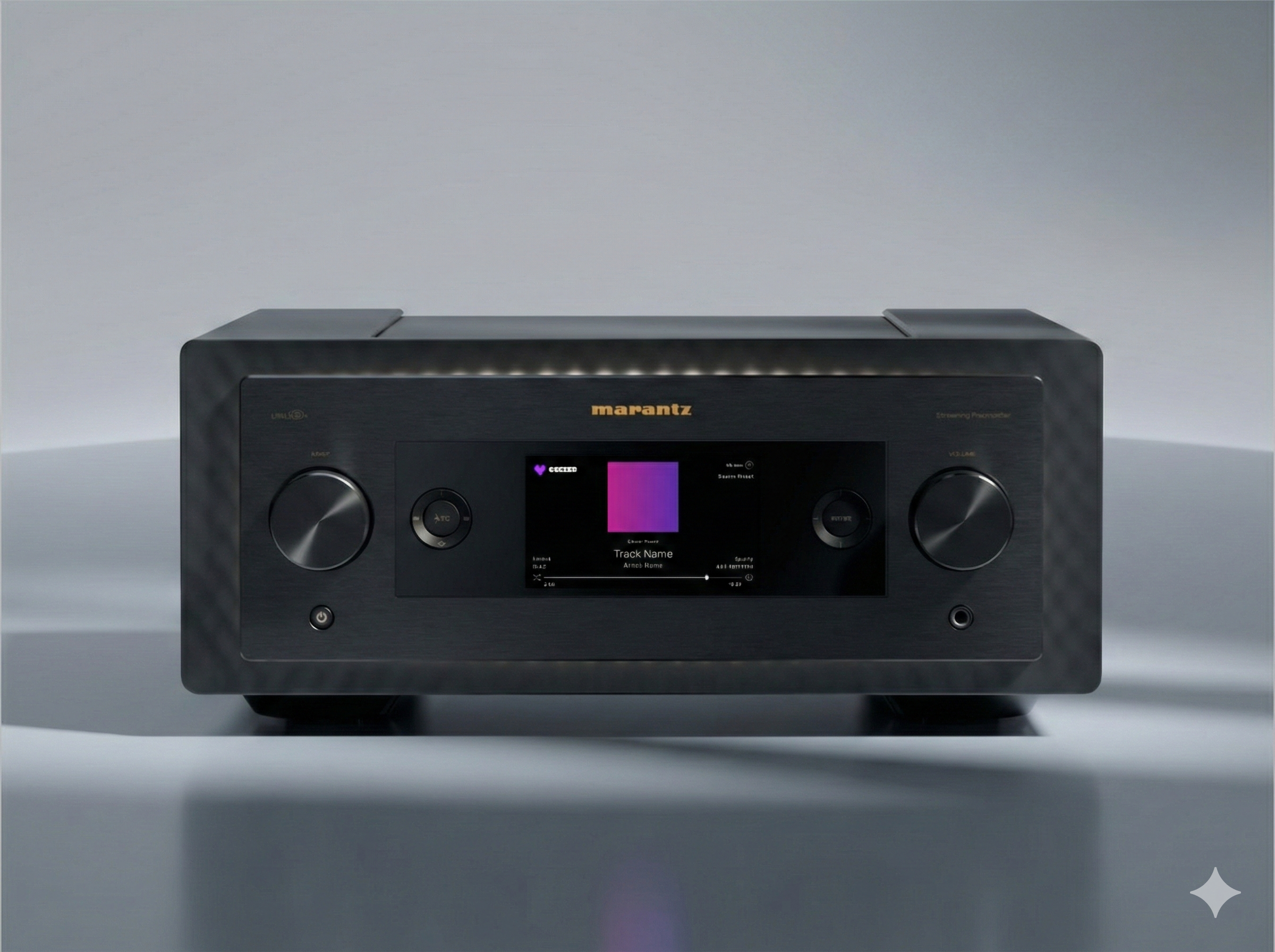
Hi-Fi Front Panel Interface
Product
Professional
Project type
Embedded GUI
Platform
Hi-Fi Consumers
Audience
Overview
Elevated the Now Playing experience from a single, static screen to a series of immersive, visually expressive views designed for premium listening.
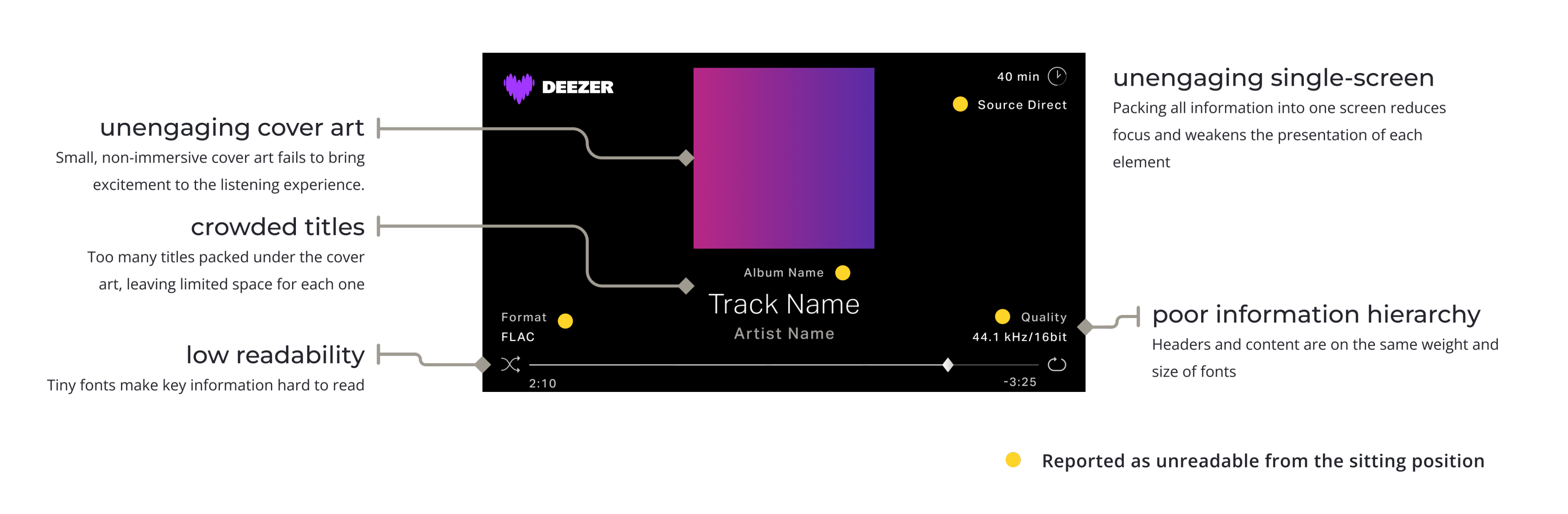
The old Now Playing screen was a simple one-page layout with tightly packed information and little visual hierarchy. The redesign elevates the listening experience by introducing larger assets and bigger cover art, making key details more visible on the small front-panel screen.
Problem
Low readability and a lack of immersion made the old Now Playing screen feel unclear and unengaging.
👀 Hard to see
Low readability made key information difficult to read on the small front-panel display.
🌀 Not immersive
The flat, standard layout didn’t create an engaging or emotional listening experience.
Usability Testing
01 Environment
Testing environment
Internal listening room
Participants
A group of 6 colleagues, ages ranging from their 20s to 50s
Device used
Sample Marantz HiFi device
Distance
- Arm’s-length distance for walk-up operation
- 2.2 m distance to simulate listening from couch
02 Setup
Testing setup
Each of the 6 colleagues sat in front of the HiFi device with two viewing positions, looking only at the front-panel screen:
- Arm’s-length for testing walk-up operation
- 2.2 m distance to simulate listening from a couch
Each colleague examined the readability of all elements displayed on the Now Playing screen, including size, clarity, contrast, and overall visibility.
Additional feedback was gathered to improve the overall experience of the Now Playing screens.
03 Feedback
All colleagues mentioned that at least some elements on the Now Playing screen were unreadable from the sitting position. Readability improved at arm’s-length distance from the front panel; however, all participants agreed that the Now Playing screen still felt unattractive and unengaging.
04 Improvements
Better readability
From our usability test results, we improved readability by increasing text sizes and reducing on-screen information to only key content. Secondary details were moved to additional screens, creating clearer hierarchy and easier at-a-glance reading.
More screens, more immersive
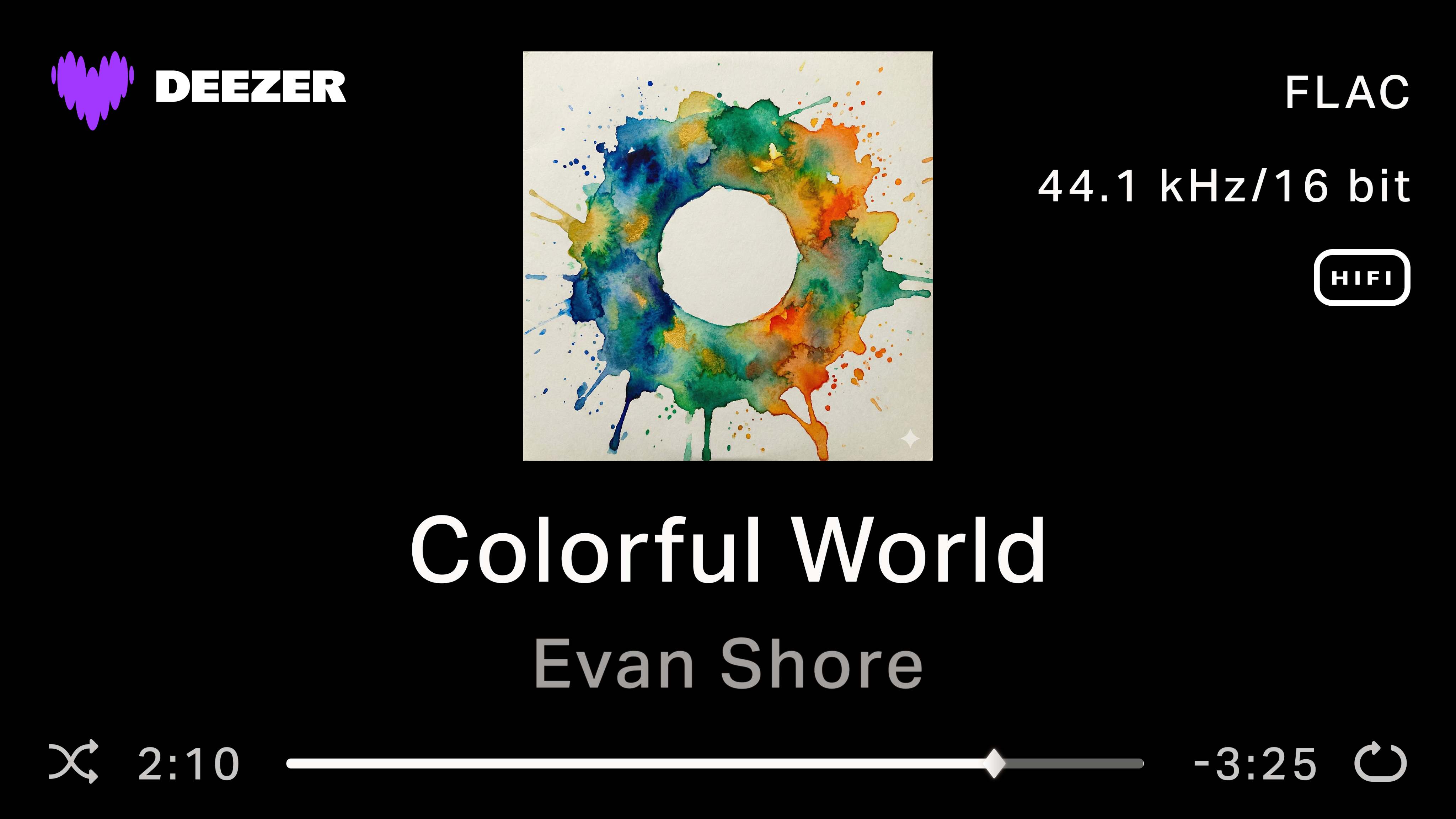
From our usability test results, we introduced additional screens to create a more immersive Now Playing experience. By dedicating each screen to a specific type of information, such as a large track title or expanded album art, users can engage with their music in a more focused and expressive way.
Results
Before
After
Ending
This redesign improves visibility and immersion on the Now Playing screen while respecting the physical constraints of a HiFi front-panel display. By grounding decisions in legibility testing and real usage contexts, the updated experience better supports both walk-up interaction and couch-viewing scenarios, delivering a clearer and more engaging listening experience.

Hi-Fi Interface Redesign
More immersive Now Playing experience
Hi-Fi Front Panel Interface
Product
Professional
Project type
Embedded GUI
Platform
Hi-Fi Consumers
Audience
Overview
Elevated the Now Playing experience from a single, static screen to a series of immersive, visually expressive views designed for premium listening.
The old Now Playing screen was a simple one-page layout with tightly packed information and little visual hierarchy. The redesign elevates the listening experience by introducing larger assets and bigger cover art, making key details more visible on the small front-panel screen.
Problem
Low readability and a lack of immersion made the old Now Playing screen feel unclear and unengaging.
Usability Testing
01 Environment
Testing environment
Internal listening room
Participants
A group of 6 colleagues, ages ranging from their 20s to 50s
Device used
Sample Marantz HiFi device
Distance
- Arm’s-length distance for walk-up operation
- 2.2 m distance to simulate listening from couch
02 Setup
Testing setup
Each of the 6 colleagues sat in front of the HiFi device with two viewing positions, looking only at the front-panel screen:
- Arm’s-length for testing walk-up operation
- 2.2 m distance to simulate listening from a couch
Each colleague examined the readability of all elements displayed on the Now Playing screen, including size, clarity, contrast, and overall visibility.
Additional feedback was gathered to improve the overall experience of the Now Playing screens.
03 Feedback
All colleagues mentioned that at least some elements on the Now Playing screen were unreadable from the sitting position. Readability improved at arm’s-length distance from the front panel; however, all participants agreed that the Now Playing screen still felt unattractive and unengaging.
04 Improvements
Better readability
From our usability test results, we improved readability by increasing text sizes and reducing on-screen information to only key content. Secondary details were moved to additional screens, creating clearer hierarchy and easier at-a-glance reading.
More screens, more immersive
From our usability test results, we introduced additional screens to create a more immersive Now Playing experience. By dedicating each screen to a specific type of information, such as a large track title or expanded album art, users can engage with their music in a more focused and expressive way.
Results
Before
After
Ending
This redesign improves visibility and immersion on the Now Playing screen while respecting the physical constraints of a HiFi front-panel display. By grounding decisions in legibility testing and real usage contexts, the updated experience better supports both walk-up interaction and couch-viewing scenarios, delivering a clearer and more engaging listening experience.